My Role
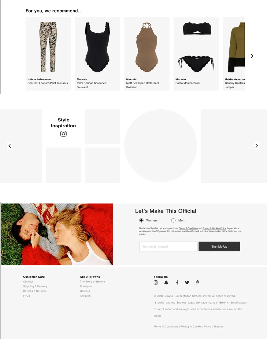
UX UI freelance designer for menswear luxury e-commerce fashion brand, Browns Fashion. My role was to offer solutions for the re-design of the product detail page to integrate social media imagery, in order to inspire their luxury consumer and aid product discovery.
Deliverables
High fidelity prototypes from mobile & desktop
Research findings presentation.
THE Discovery PROCESS
Stakeholder Interviews > Business Goals > Site Content Analysis > Heuristic Evaluation > Competitor SWOT Analysis > User Journey Empathy Map > User Personas > UX Copy Writing Guidelines > Site Data Analysis > Acquisition Drivers > Behaviour Flows > Heat-mapping > User Research > Usability > Surveys> Taxonomy Card Sorting
↓
What is it?
An additional strategic feature to inspire and aid further product discovery.
//
AOV revenue growth (business goals)
-
Additional product discovery for confidence and trust in styling options (user goals)
-
Differentiate from the crowd (market goals)
Where will it be used?
Websites responsive product page across desktop, mobile and tablet. Implemented globally.
Key objectives, to not distract the user from their initial purchase funnel with the added content as increasing the number of choices can be overwhelming for the user and increase the decision time of making a purchase decision.
This was achieved by conducting focus groups and stakeholder meetings to understand how choices for the user could be broken down to smaller steps and highlighting recommended options.
Who is it for?
Defining the user personas by stakeholder interviews to include customer service and marketing in addition to complex user research methods.
Understanding the demographics and personas of the users is a key tool for further UX UI development. With Browns Fashion, their e-commerce store wireframes are tailored to appeal to both male and female demographics which have a variety of different needs. Extensive interviews, usability testing and focus groups were performed to understand the optimised solution to suit all personas and demographics.
Page Audit // Positives
Understanding how the current page performs for the customer is key prior to developing a UX solution. Below you will see a top-level overview of analytical research findings performed to determine the positive usability characteristics of the product page as it originally stood (including; heuristic evaluation, heat mapping, Google Analytics analysis & usability testing).
Well branded | Contemporary copywriting | Strategic page design and focused user experience | Clear CTA | Links to variants ie. size/colour & "you may also like" | Product details reflect price and speak to customer | Optimised across all devices.
Page Audit // Improvements
As mentioned above, understanding how the current page performs for the customer is key prior to developing a UX solution. Below you will see a top-level overview of analytical research findings performed to determine the key improvements to be made to enhance usability.
Aspirational Content - ie. limited edition exclusives to ensure the products feel unique as the Browns brand itself.
Social Proof - ie. product reviews, generally written reviews but these can also take form in the way of imagery shared on platforms like social media.
“Nearly 63% of consumers indicate they are more likely to purchase from a site if it has product ratings and reviews.”
Here at browns we are all about being ‘Revolutionary’. We are constantly looking to ‘Amaze Customers’ by pushing boundaries to ‘Be Brilliant’.
Competitor Market Analysis
I find competitive market analysis to be a valuable research tool for creating a user-friendly product that is effective, if used wisely & in addition to other qualitative & quantitative research techniques. I say this as having worked in a variety of companies, many features sites develop are not user centric and are regularly not performing as a competitor may assume they are.
Studying competitor sites in this case allowed clarity on the following; standard practice, leading approaches, approaches to avoid and other interesting out of the box notes to be aware of.
THE Define PROCESS
By examining the output of the discover stage research, I identified problems/pain points and created solutions that acted as the baseline of the design process.
Affinity Map > Conclusion > User Journey
↓
Affinity Map
So, the discovery UX stage has come to a point of analysis - how do I do this most effectively? Affinity mapping. I’m sure you’ve all seen a UX designer with a gazillion post-it notes … well this is why.
Affinity mapping, is the greatest method to make sense of a whole lot of mixed data such as facts, research, ideas, user opinions, user need, insights, design issue etc. as it bundles and groups information to give trends and context to the findings.
When your mind is full of research findings and ideas, affinity mapping is the tool to collate into digestible trends to move forward with.
Conclusion
Why people shop with Browns Fashion and why we diffrenetiate.
What products, information and services engage customers globally.
Who are the customers and who else do they shop with.
How are customer acquired on a global omni channel scale.
↓
User Journey/s
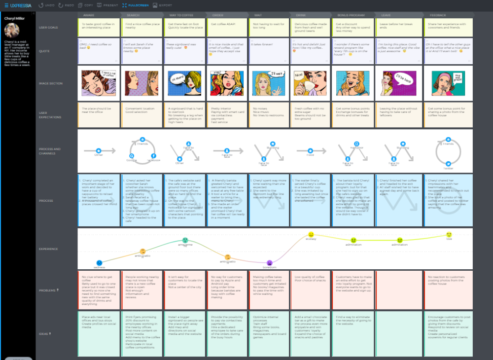
With the user journey maps, I made sometimes granular but pivotal tweaks that helped users accomplish their goals easier and faster, come back to do it again, and build habits around the Browns Fashion product and brand.
Cognitive load is the amount of information that a person can process at any given moment. As a UX designer, I forever consider a user’s cognitive load as it helps prevent the user from being overloaded with too much information all at once. Quality, not quantity!
THE Design PROCESS
Mid-Fidelity Wireframes for mobile & desktop > Stakeholder Feedback > Usability Testing > High-Fidelity Wireframes > Handover to developers
As a Freelance UX UI Designer, when it comes to designing there are multiple UX factors I think of every step of the way, a key one is recognition patterns, whereby I apply various UI techniques to make the interactions familiar to what the certain features that users both consciously and subconsciously expect to see.
Integrating social media imagery into the product page
↓
Typography & motion graphics
↓
Social media banner at footer of page
↓
OTHER DESIGN Services
↓
PEOPLE SAY Nice Things
↓
“Lauren is an exceptionally talented, hard-work and diligent professional. She works swiftly and is totally reliable. She understands our business goals and has become an integral part of the team, leading all our UI and UX work. She is currently instrumental to a complex multi-territory re-platforming and site build.”
“Lauren is a rare designer who is able to take any brief (no matter the detail) and quickly and stylishly incorporate what is needed into a fantastic creative. Working with Lauren across multiple digital & offline channels was always enjoyable - and looking forward to receiving her designs was a real pleasure!”
“Lauren is a huge asset to our team; she came into the business at a busy and stressful time and has been an absolute delight to work with. She has easily adopted and enhanced our brand handwriting. Lauren is efficient, focussed and gets the job done to a very high standard and has become an integral part of our team and is high respected in the business. She is also flexible to our needs, adding extra time during our busy periods, which is much appreciated. In a busy and often stressful fashion environment she is calm, collected and fun to work with.”
“Just spot on - thank you!”


