CASE STUDY
16% checkout uplift, through smarter information placement.
The brief
In a competitive travel market where every interaction shapes conversion, Eurostar wanted to optimise its booking experience.
They needed a solution informed by user feedback and behavioural data, leveraging core UX principles and insights from user psychology.
↳ The goal: Drive measurable business impact + reset the bar completely.
A glimpse of the metrics achieved
+16%
more visits to checkout
-3.6%
exits on outbound page
-5.3%
exits on upsells page

A glimpse of the result
1. THE OPPORTUNITY
Create a more seamless & engaging booking experience that reduces the [behaviour] to switch devices.
The opportunity
(based on data insight + moderated user testing)
Eurostar operates in a highly competitive travel market, where customer expectations for seamless, intuitive digital experiences continue to rise.
As travellers plan and manage journeys across multiple touchpoints, the ability to access key actions effortlessly - such as reviewing trip details, modifying selections, or proceeding to checkout - plays a crucial role in maintaining engagement and driving conversions.
I identified where users experience moments of friction during the booking flow. This was particularly when essential actions were not persistently visible or easily reachable.
The theory: The lack of continuity increased cognitive effort and disrupted the sense of progress, often resulting in hesitation or drop-off before checkout.
This presented a strong opportunity to enhance Eurostar’s booking experience through strategic UX improvements focused on visibility, accessibility and continuity of action.
Discovering the opportunity
〰️
Discovering the opportunity 〰️

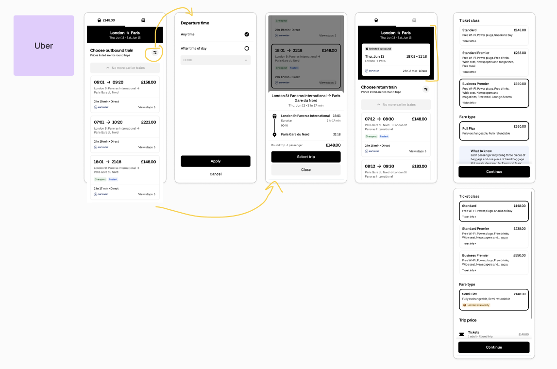
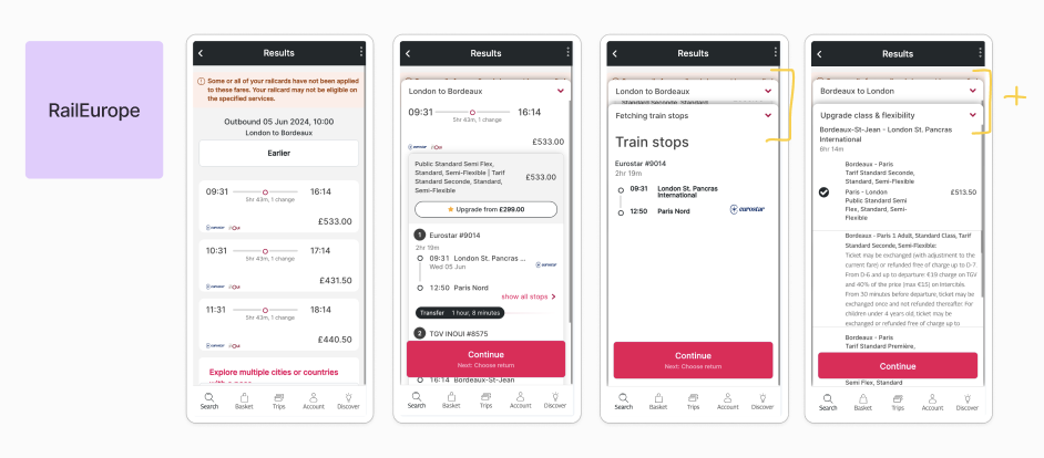
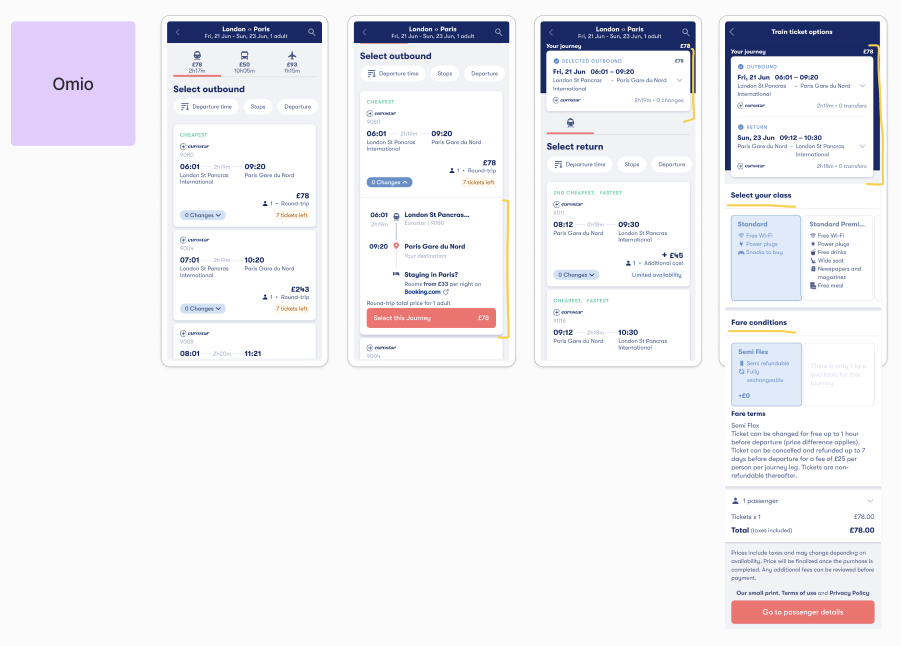
↳ Usertesting + data analysis to understand the value of each element on the page to the user and the business.

↳ Usertesting analysis across the travel market to collate a collective comparison of preferences and moments of friction.


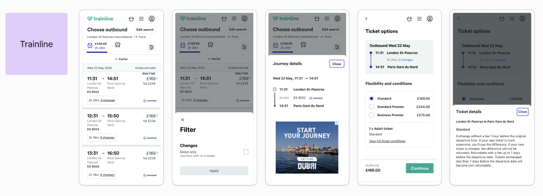
Researching flows across the market. How do they handle showcasing important information? What do they prioritise? How do they use AI to personalise the experience? How does the design differ between breakpoints?


The opportunity: Summary of findings
Difficulty finding key actions
[UX principle: Findability]
Difficulty accessing information
[UX principle: Visibility]
2. THE SOLUTION
Redesign the search experience so that all essential actions + information are within easy reach.
2. The solution
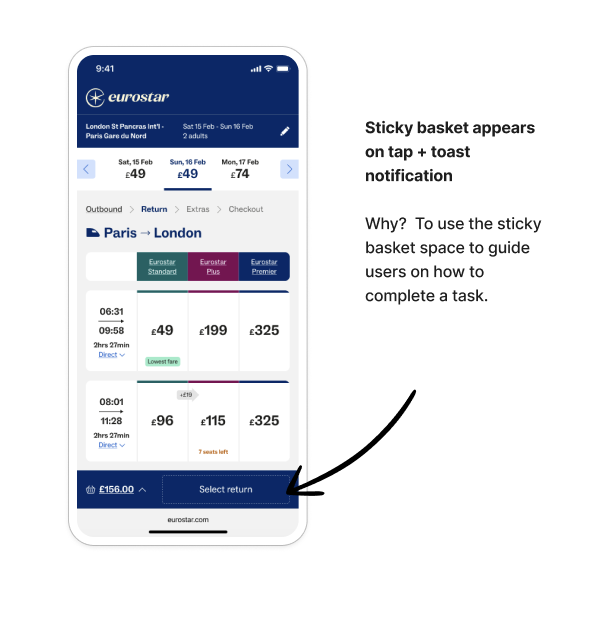
Introducing a sticky CTA (call-to-action) and an optimised, always-visible richer basket. The design ensures critical interactions remain within immediate reach throughout the booking journey.
This approach reduces friction, lowers cognitive load and supports smoother task completion. The decision is informed by both quantitative data—highlighting points where users dropped off or hesitated—and qualitative user feedback, which revealed confusion around inaccessible or hidden actions.
Together, these insights guided the design toward a more continuous, intuitive and user-centred experience.

Test
〰️
Listen
〰️
Iterate
〰️
Test 〰️ Listen 〰️ Iterate 〰️
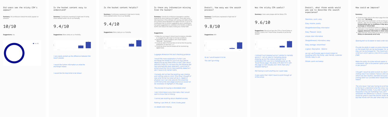
“I honestly did not feel that anything was missing and nothing came to mind. Only thing I thought of was what format my ticket will be in, digital or physical, but I can only assume this would be confirmed at the next stage anyhow so would not be necessary to highlight on this page.”
Solution: I recommended a follow-on project focused on improving clarity by surfacing the right information and Eurostar USP’s at key moments. This can be strengthened through contextual personalisation based on search criteria - such as passenger type, destination, or journey type - to address both universal and journey-specific user concerns.

“I would like further information on what the exchange means.”
Solution: adjust wording to be more explicit when talking about exchanges and refunds, even at a high level (this user is referring to a bulleted list of inclusions).

“I really like the level of info shown here. I was expecting this info to come later. It’s a nice surprise. Usually, I feel like you’re made to jump through lots of hoops to answer those questions”.
This came through lots of testing to find the right balance of key information vs. overwhelm of cognitive load.

Team work
〰️
Makes the dream work
〰️
Team work 〰️ Makes the dream work 〰️
Implementing the sticky CTA and always-visible basket required significant technical consideration. The basket needed to work seamlessly across a wide range of use cases, from wheelchair bookings to scarcity messaging, multi-app behaviour and key initiatives like selling connections. Each scenario introduced unique rules, states and exceptions that made a single universal solution challenging.
By working closely with the developers, we streamlined this complexity, co-creating a flexible template that could accommodate all major user cases and edge cases without duplicating logic across platforms. This collaborative approach allowed us to deliver a consistent, scalable basket experience that stays with users throughout the search journey.
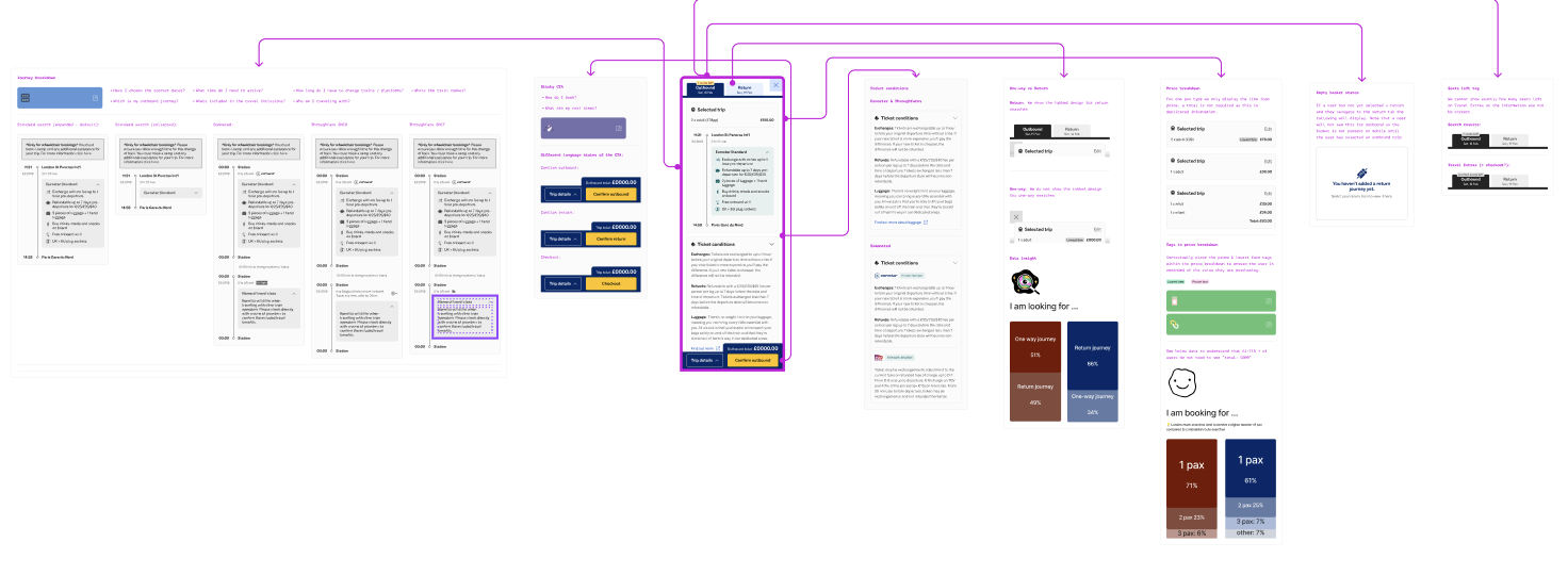
↳ Annotations for various use cases, including the UX rationale, usertesting feedback and data insight.
↳ Moderated user testing of the mobile design to understand intial feedback and areas of oversight or improvement


2. The solution: Summary of findings
Consistency
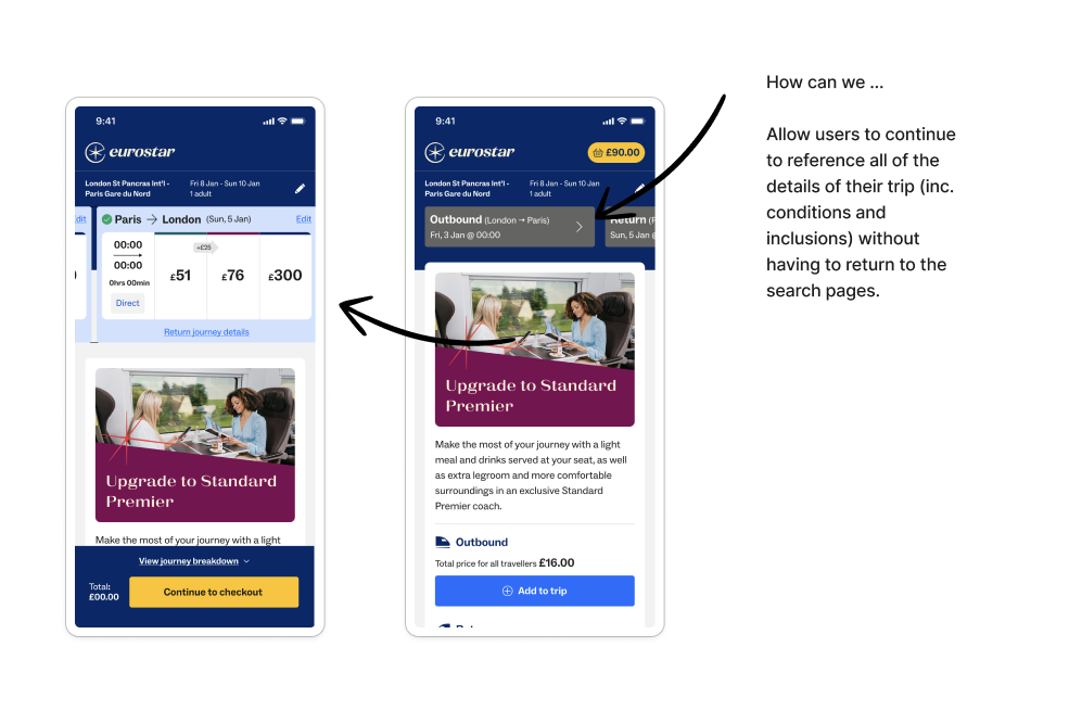
The sticky CTA provides a constant visual reminder of the user's selected trip and total cost. This reduces cognitive load by keeping critical information front and centre. By making the trip details accessible via a modal, users can quickly review their selections without losing their place in the search flow.
Review your trip at any time
The modal design for trip details allows for a comprehensive view of the users journey/s without cluttering the primary interface / search results. It offers flexibility for users to review their trip at any time, reinforcing confidence in their choices.
Expectations
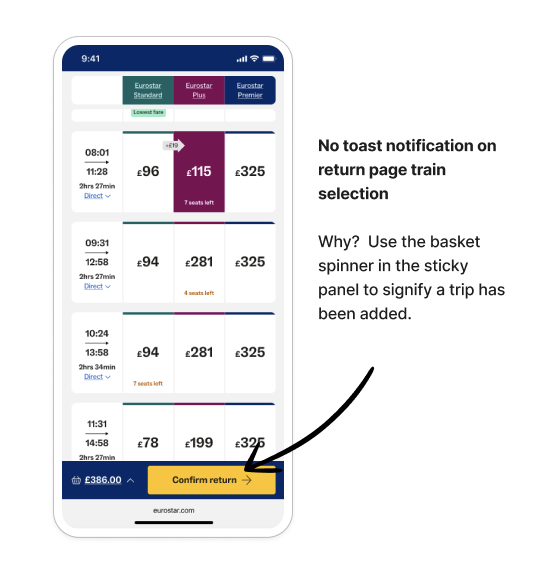
By moving away from the "add to basket" metaphor, the interaction is simplified and reduces ambiguity. Users are less likely to assume they can compare multiple trips simultaneously, avoiding disappointment or confusion.
Key actions
The sticky CTA ensures that key actions (e.g. proceeding to checkout) are always visible and easily accessible, increasing the likelihood of conversions.
The clear, persistent presentation of pricing fosters trust and transparency, reducing hesitation during decision-making.
Urgency
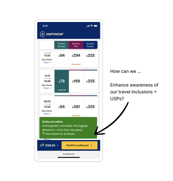
The urgency tags shown on the search results have been brought into the basket/trip details design to further enhance the impact of the messaging throughout the entire users journey.
3. THE IMPACT
+16%
more visits to checkout
-3.6%
exits on outbound page
-5.3%
exits on upsells page
3. The impact
These results confirmed the hypothesis: improving continuity, visibility and access to key actions meaningfully reduces friction and keeps users progressing with confidence.
NEXT STEPS
While the redesign significantly improved performance, the data highlighted further opportunities to refine clarity and interaction patterns:
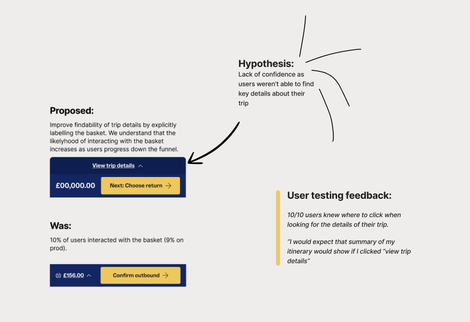
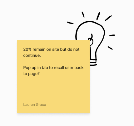
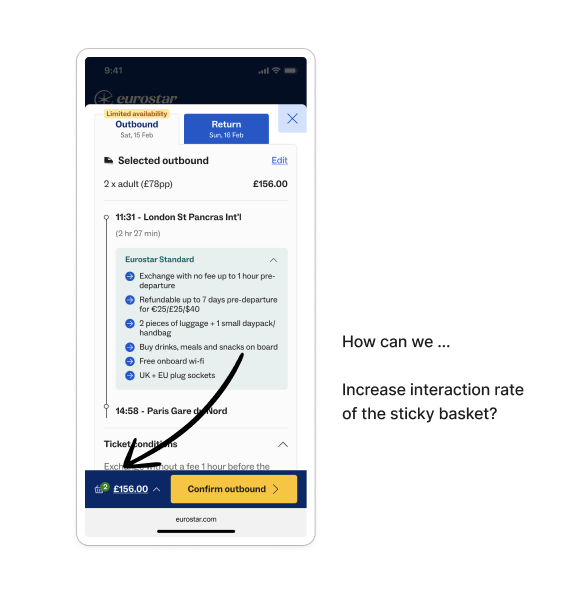
Increase basket visibility: The majority of users didn’t open the basket, signalling a need to elevate its prominence and reinforce its value.
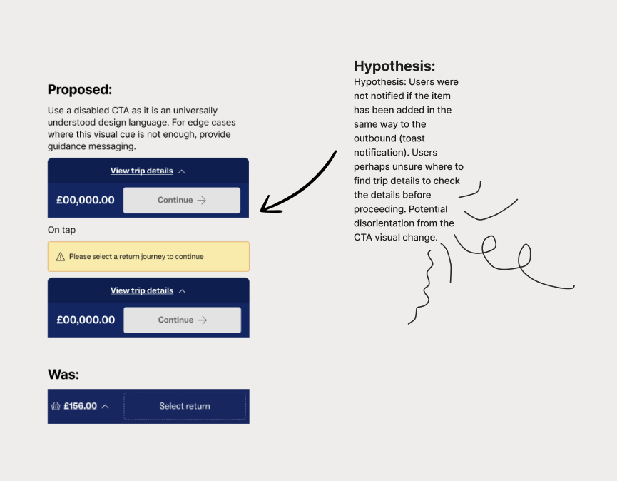
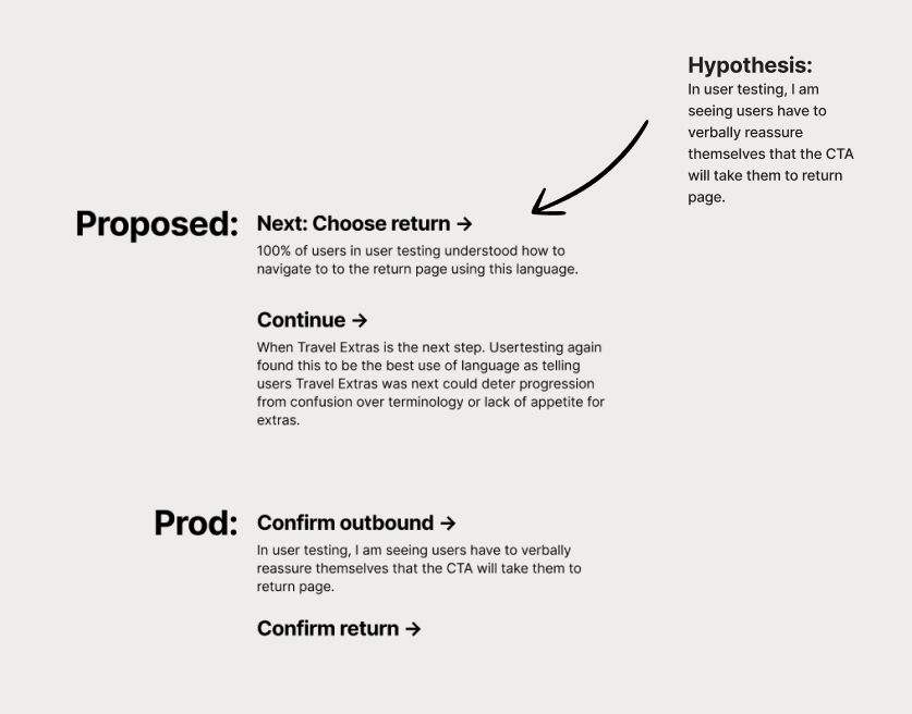
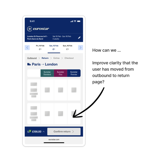
Improve clarity on trip-selection pages: Introduce a disabled CTA on the return-leg page to better signal that the next step isn’t yet available, as the current button state appeared actionable too early.
Clarify CTA language: Shift from generic labels (“Confirm outbound”) to more anticipatory guidance (“Next: choose return”) to better set expectations.
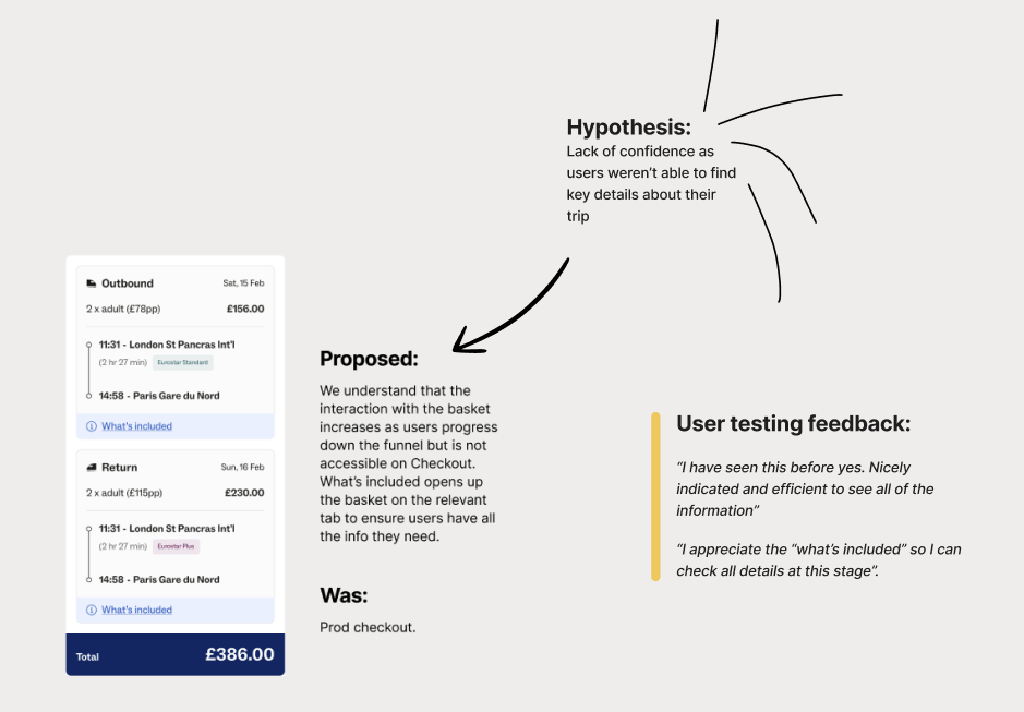
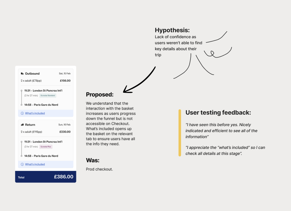
Unify the experience across the funnel: Extend testing to include the checkout page so search and checkout no longer present two different basket experiences.
Together, these next steps aim to build on the strong initial impact by deepening clarity, reinforcing progression cues and ensuring a seamless, consistent journey from search to checkout.