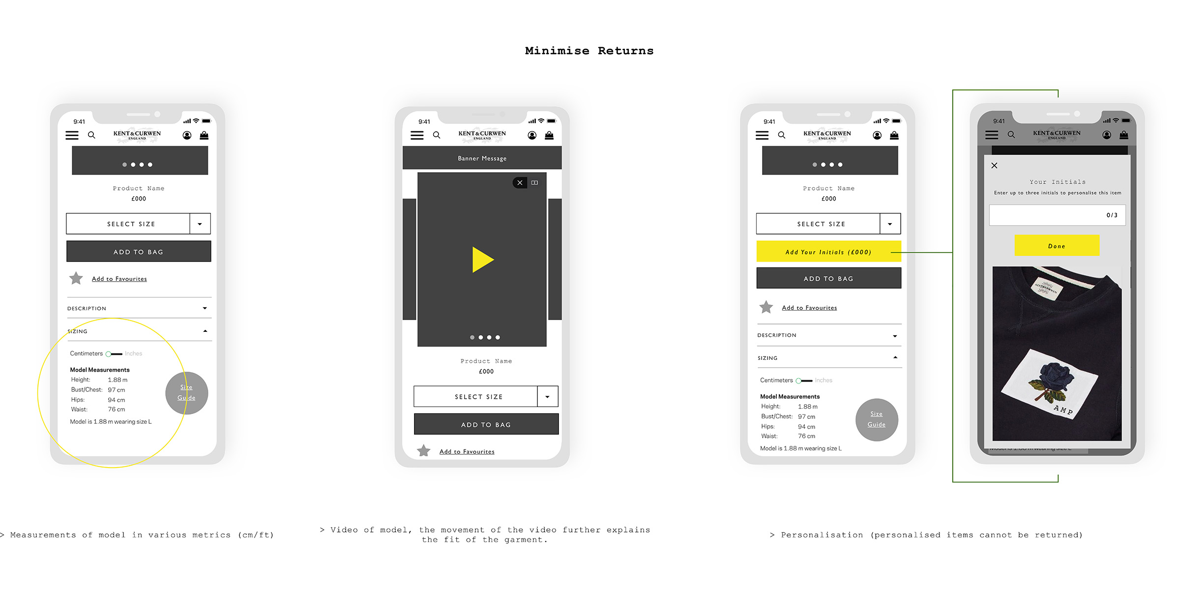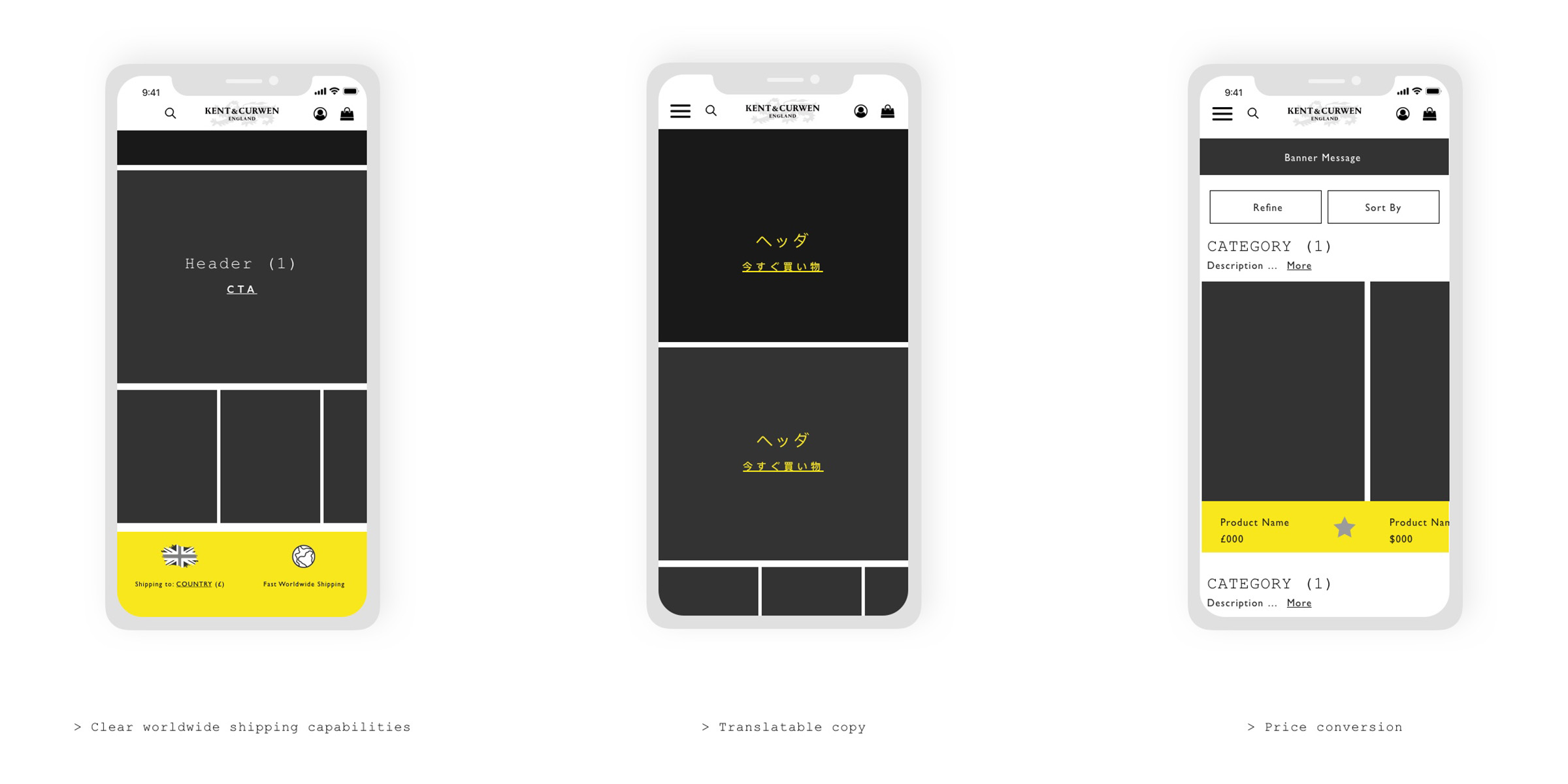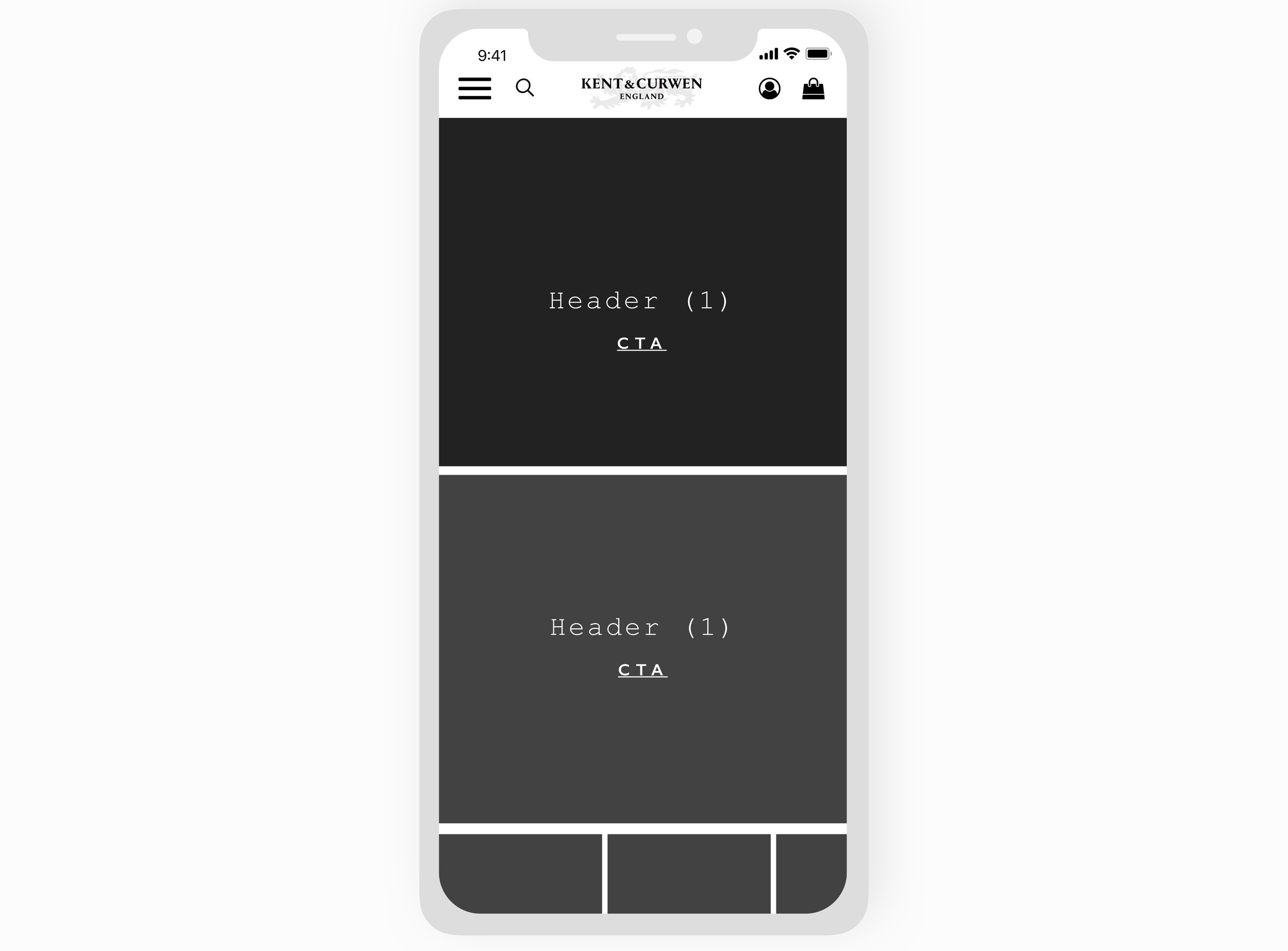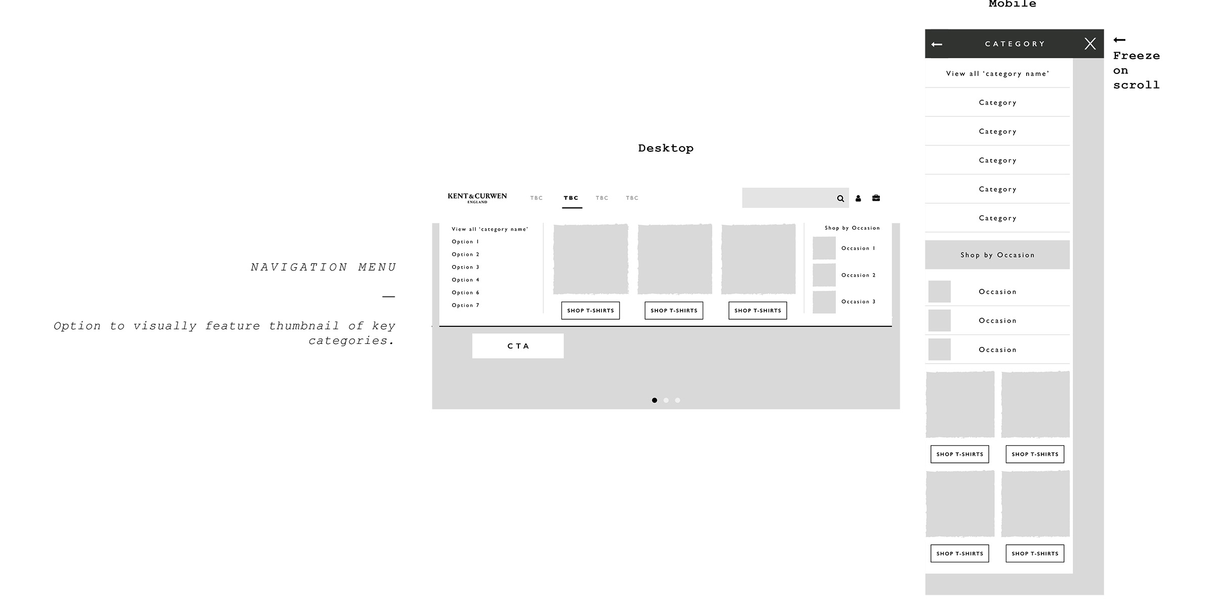
My Role
UX UI freelance designer for menswear heritage sportswear fashion brand, Kent & Curwen. Working on a monthly retainer basis managing the UX, UI & digital marketing deliverables.
Championing the importance of good UX by providing stakeholders with UX insight into quality customer journeys with first-rate functionality, design and accessibility across their digital channels defined by user, market and usability research and analysis. Translating research to wireframes, sitemaps and high-fidelity UI designs in Sketch and InVision. Creating all digital marketing assets such as e-mail newsletters, website banners and social gifs.
Deliverables
UX Research, Journeys & Presentations
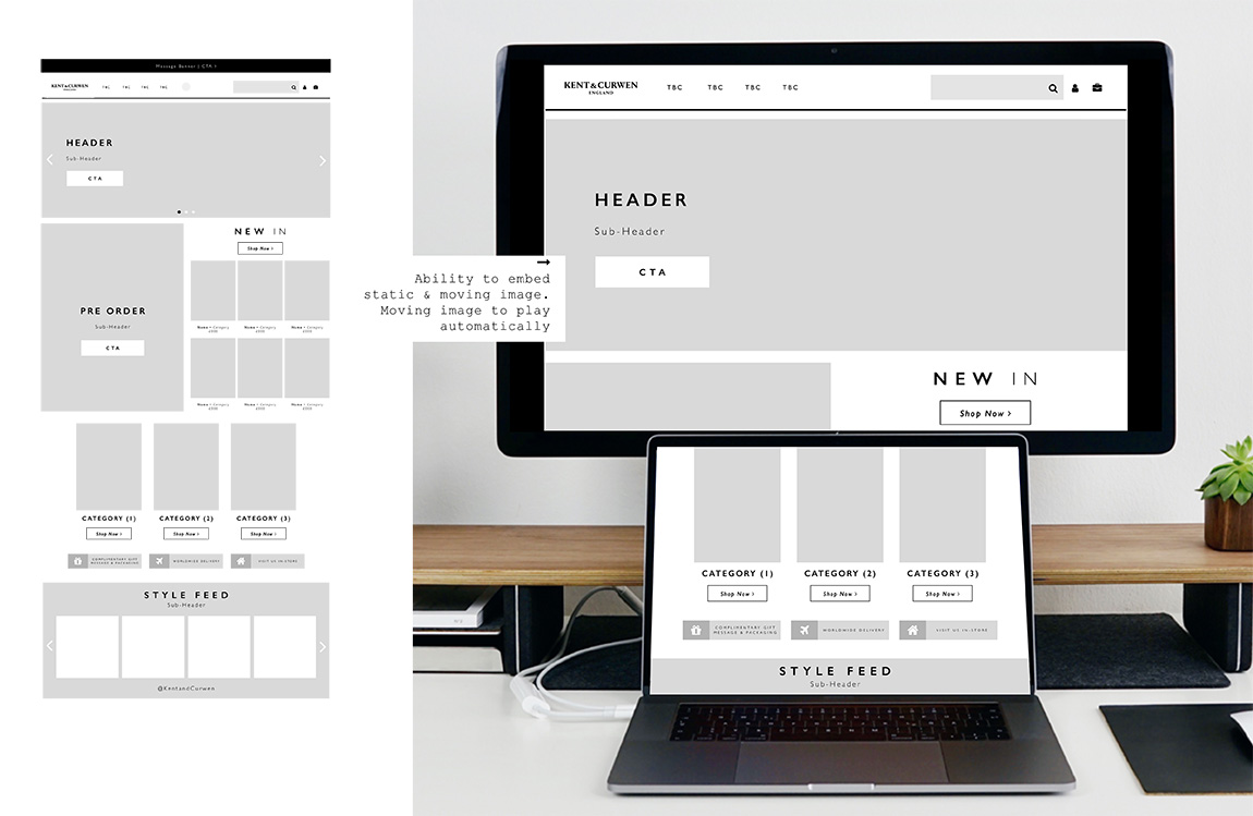
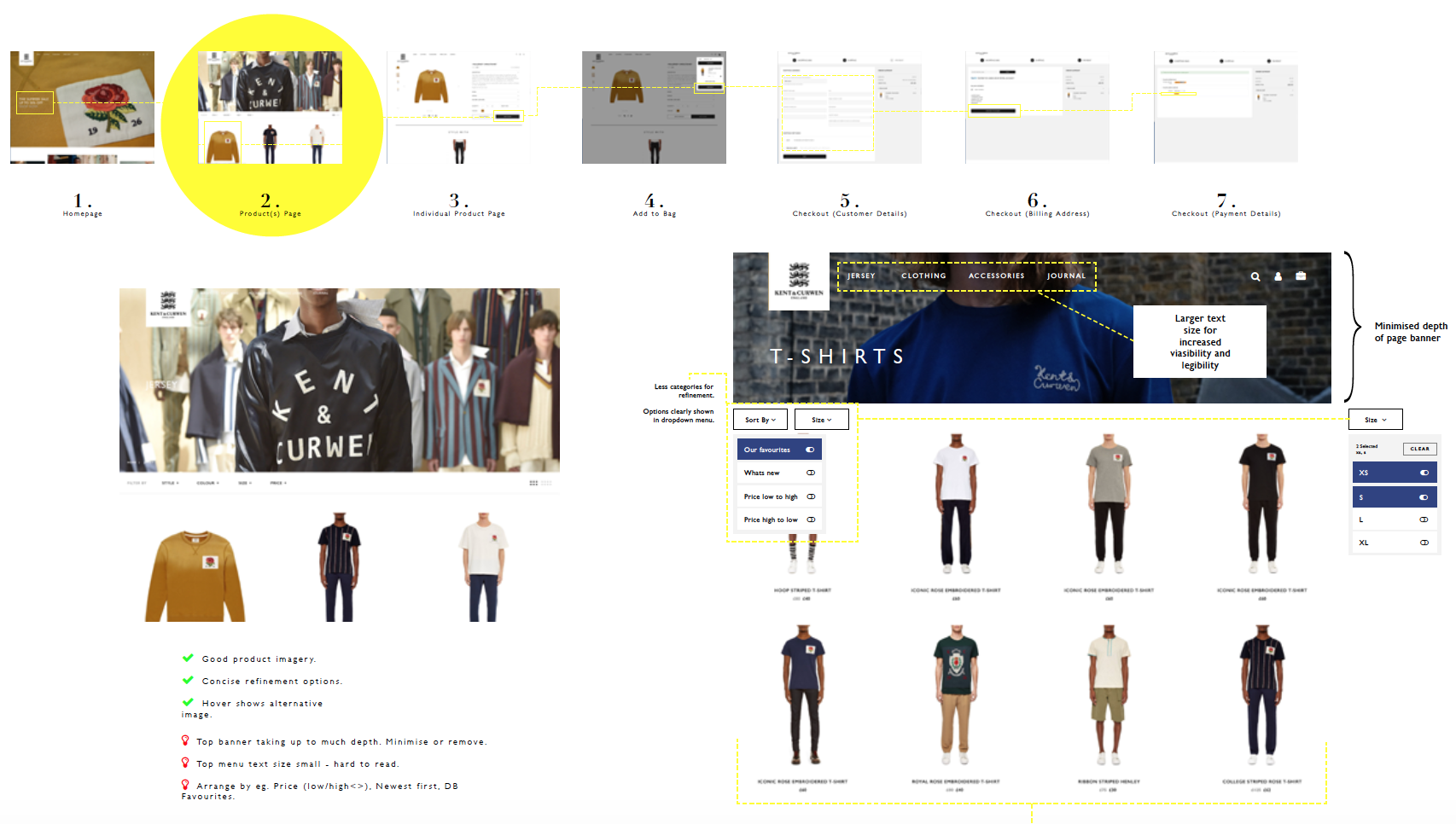
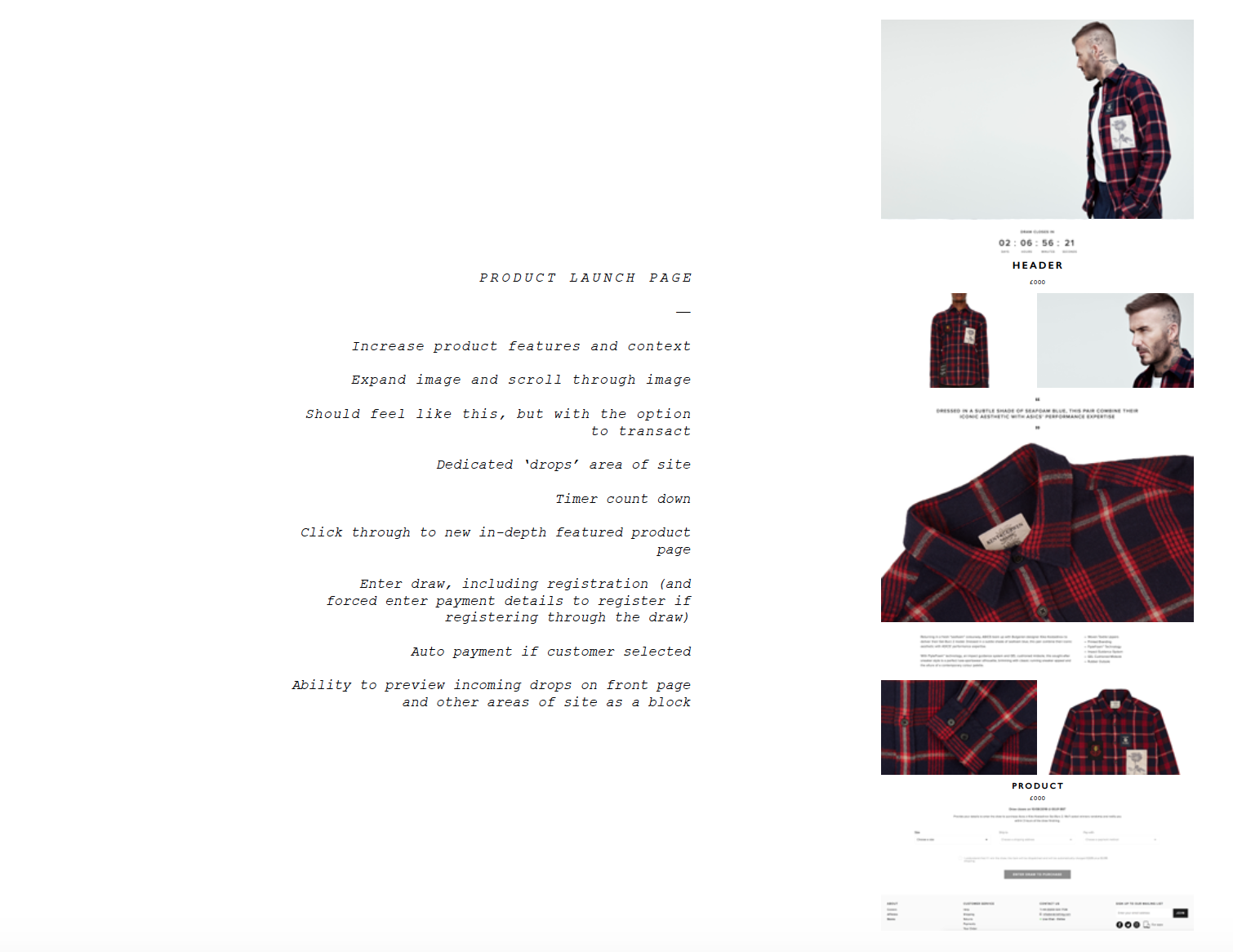
UI Wireframes, Sitemaps & Interactive Prototypes
MailChimp Email Newsletters
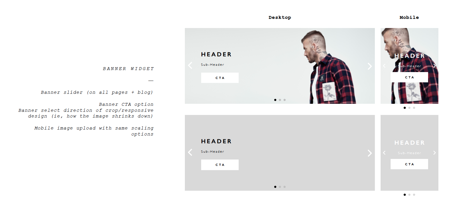
Digital Banners & Assets
Socials Assets inc. gif & mp4
Photographic Retouching
THE Discovery PROCESS
Stakeholder Interviews > Business Goals > Site Content Analysis > Heuristic Evaluation > Competitor SWOT Analysis > User Journey Empathy Map > User Personas > UX Copy Writing Guidelines > Site Data Analysis > Acquisition Drivers > Behaviour Flows > Heat-mapping > User Research > Usability > Surveys> Taxonomy Card Sorting
↓
Stakeholder Interviews
Meetings with the Creative Director, Marketing Director, Head of Social and Head of E-Commerce to define the scope of the departmental requirements on a week-by-week and project basis. This ranges from understanding future developments for market growth, branding strategy, upcoming partnerships & events, margins & budgets and collections/items to push.
Business Goals
I recommend this as a great task to do, whatever your role, for yourself or your team, as I feel it’s hugely important that everyone within a company is working towards the same mission and know how they are individually or as a team impacting and helping to support and enable the wider company mission.
What is the company mission? How can the mission be segmented into goals? From this, how can (in this case UX) be segmented to help deliver these goals?
In this case, the strategic goals boiled down to increasing revenue, developing new ranges for new markets and increasing staff retention & development. As a top level overview, UX supports these goals and makes them possible by methods such as increasing AOV, developing the relationship with existing customers, site architecture, wireframes and involvement of staff in the project/s.
Heuristic Evaluation
Delight the users with the best experience by providing exactly what they want is my ultimate goal. I therefore perform extensive research techniques to get a better understanding of the K&C target users and their desired needs. I start doing this by understanding how the current responsive website caters to the user by performing a heuristic evaluation and repeat this evaluation at milestones throughout the project to asses progress.
A heuristic evaluation is a usability inspection method for computer software that helps to identify usability problems in the user interface design. It specifically involves evaluators examining the interface and judging its compliance with recognised usability principles.
Market Analysis
Another continued research method I perform at regular intervals, analysing the market trends and competitors to stay inspired, considered and up to date with market trends, opportunities and initiatives.
Current User Journey Empathy Map
Focusing primarily on the key customer journeys and personas across both mobile and desktop, I create an empathy map (and have done so in group workshops too) to clearly iterate and understand the users thoughts, needs, motivations, feelings, attitudes, beliefs and issues when going on said journey.
The information for this is gathered not only from my knowledge base but through speaking with users and usability analysis.
I find empathy maps to be a great collaborative tool in all UX studies. Many create an empathy map at the end of a study of how the journey should make the user feel. I however, find it important to understand the users current mindset to understand clearly ways and areas in which can be dramatically improved.
User Personas
Defining the K&C User Personas was strategised using a combination of research methods. From quantitative research looking at the back-end order analysis, to qualitative focus groups and interviews with the in-house customer service and flagship store teams. Alongside this, due to the large and engaged following on their social media channels, I was able to further identify the user personas demographics, behaviours and ambitions and truly put a name to a face.
Combing the user persona research we developed three key personas that were presented throughout the company.
Site Data Analysis
Data analysis – both quantitative and qualitative – assisted in informing innovative decision-making for the K&C design direction and confirming methodologies that developed from the previous forms of user research. Having a multidimensional understanding of what the data is telling me and looking at it from different angles allows me to develop the UX process with real un-biased insight. In this instance, an example could be on a real top level, this study allowed me to identify what interfaces are most widely used and how the user converts using this interface.
“Statistics help us summarise and understand the hard data we collect, and instincts do the same for all the messy real-world experiences we observe. And that’s why the best products — the ones that people want to use, love to use — are built with a bit of both.
”
Magento/CMS Analytics
Understanding the product as well as the user was a key tool in success for this project. As a UX designer, I must understand the current state of the business from multiple angles, one being the popularity of product, why it is popular and does its popularity makes business sense - ie. are the margins effective for this product? Is there a pricing issue? Are there variables of this products? Is it available all year round? Etc. you get the jist.
This allows me to understand what the customers are looking for and how I can effectively guide them to this goal in the most beautiful and efficient way whilst meeting the business goals of increasing AOV and repeat customers.
Heat & Click Mapping
Heat and click mapping using HotJar, was a key UX research tool for visualising the way K&C users interacted and engaged with the current pages and interface at scale before usability testing for a far more granular assessment. I was able to combine the heat and click mapping knowledge with my user understanding thus far and ideate quick sketches of more effective solutions.
As with the whole UX process, although linear in principle, in practise all research outcomes are developed, A/B tested and re-analysed constantly throughout the study to ensure problems are discovered, understood and solved.
Note. Consider when the data has been collected for heat-mapping - was it payday, did David Beckham just socially share an image of him in a K&C piece. Factors such as this must be noted to ensure data is valid and not skewed.
Surveys - User Research
As a Freelance UX/UI Designer, I use Typeform to carry out user research surveys as they are conversationally intuitive, easy to use and thus have a better conversion rate in response.
To ensure the K&C product was developing in the right direction and gain insight into the priority of findings, as a team we put together a strategic UX survey as I felt this was the best research technique to validate the hypothesis quantitatively, gather extra information/data quickly that I could then segment, as we had access to a large number of respondents on the database.
Usability Testing - User Research
Performed across both mobile and desktop with existing and non-existing customers, the usability testing not only uncovered new understandings, but also confirmed previous research understandings.
Usability testing was practised throughout the study, both to determine and confirm issues prior to design initiation and also consistently and constantly throughout the design stage to ensure the prototype and wireframes are appealing to the user and answering the hypothesis.
As a Freelance UX designer, I am forever analysing the visual hierarchy of an interface, which is directly related to content readability. Before reading a page, a user will scan it to get a sense of interest. The most common scanning patterns are F and Z patterns.
Card Sorting - User Research
Determining the site architecture and taxonomy was a challenging task, simplified by the use of card sorting. As with many e-commerce brands, ensuring categories and products are clearly labelled, filed and organised in a language that identifies with all users is a constant battle.
With K&C’s current website being an MVP that developed additional un-strategic layers as the business developed, much of the taxonomy and naming functions were applicable more so for the staff lingo/jargon/acronyms and not for the user. This issue came up multiple times within the study, specifically from the social media and customer service team where customers were unable to find the product they were searching for.
Card sorting was performed in a range of programmes/techniques from paper card sorting to online (with Optimal).
THE Define PROCESS
By examining the output of the discover stage research, I identified problems/pain points and created solutions that acted as the baseline of the design process.
Affinity Map > Conclusion > Information Architecture > User Journey
↓
Affinity Map
So, the discovery UX stage has come to a point of analysis - how do I do this most effectively? Affinity mapping. I’m sure you’ve all seen a UX designer with a gazillion post-it notes … well this is why.
Affinity mapping, is the greatest method to make sense of a whole lot of mixed data such as facts, research, ideas, user opinions, user need, insights, design issue etc. as it bundles and groups information to give trends and context to the findings.
When your mind is full of research findings and ideas, affinity mapping is the tool to collate into digestible trends to move forward with.
Conclusion
Why people shop with K&C, why are we different to other brand.
What products, information and services engage customers globally.
Who are the customers and who else do they shop with.
How are customer acquired on a global omni channel scale.
↓
Site/Information Architecture
Users x Content x Context = Site/Information Architecture
It is of upmost importance to produce content that user will find valuable, but equally that the content is findable.
We live in a world where users expect to find solution to their problems with the least amount of effort in the quickest amount of time. Time is therefore he most previous resource people have and when the process of finding information is too complicated or too slow, there’s a high risk users will abandon their journey.
For K&C, I found that displaying visual hierarchy was a valuable asset to Information Architecture (IA), not only because it provided better context for the developer and stakeholders but also generalised key regions of the product. To give this context, the most significant feature can be accessed from the homepage, which of course means that page will have the most touch-points and therefore be of most value.
User Journey/s
With the user journey maps, I made sometimes granular but pivotal tweaks that helped users accomplish their goals easier and faster, come back to do it again, and build habits around the K&C product and brand.
Cognitive load is the amount of information that a person can process at any given moment. As a UX designer, I forever consider a user’s cognitive load as it helps prevent the user from being overloaded with too much information all at once. Quality, not quantity!
THE Design PROCESS
Mid-Fidelity Wireframes for mobile & desktop > Stakeholder Feedback > Usability Testing > High-Fidelity Wireframes > Handover to developers
As a Freelance UX UI Designer, when it comes to designing there are multiple UX factors I think of every step of the way, a key one is recognition patterns, whereby I apply various UI techniques to make the interactions familiar to what the certain features that users both consciously and subconsciously expect to see.
Mid-Fidelity Wireframes
↓
High-Fidelity Wireframes
↓
OTHER Design OUTPUTS
For Kent & Curwen, as I work with them on a monthly retainer basis I cover other areas than just UX & UI as shown below.
Weekly E-mail Newsletters
Targeted, segmented and analytically reviewed on a weekly basis.
↓
Retouching
Using Adobe Lightroom & Photoshop
↓
Social Assets
↓
Presentations
Presentations to stakeholders and templates for the wide business to use.
↓
SUMMARY & Results
↓
Increased conversion rate for new and existing customers globally across all channels (mobile/desktop/tablet).
Increased AOV.
Additional countries ordering globally.
Decreased customer service enquiries.
Decreased design to dev handoff time.
Refined arrival to checkout process.
Increased engagement and conversion from email marketing.
MEET THE Team
The added bonus of working freelance is that I get the chance to be constantly inspired by meeting new amazing people
↓
OTHER DESIGN Services
↓
PEOPLE SAY Nice Things
↓
“Lauren is an exceptionally talented, hard-work and diligent professional. She works swiftly and is totally reliable. She understands our business goals and has become an integral part of the team, leading all our UI and UX work. She is currently instrumental to a complex multi-territory re-platforming and site build.”
“Lauren is a rare designer who is able to take any brief (no matter the detail) and quickly and stylishly incorporate what is needed into a fantastic creative. Working with Lauren across multiple digital & offline channels was always enjoyable - and looking forward to receiving her designs was a real pleasure!”
“Lauren is a huge asset to our team; she came into the business at a busy and stressful time and has been an absolute delight to work with. She has easily adopted and enhanced our brand handwriting. Lauren is efficient, focussed and gets the job done to a very high standard and has become an integral part of our team and is high respected in the business. She is also flexible to our needs, adding extra time during our busy periods, which is much appreciated. In a busy and often stressful fashion environment she is calm, collected and fun to work with.”
“Just spot on - thank you!”


