My Role
Freelance UI digital interface designer for Lyst - the largest global fashion search platform.
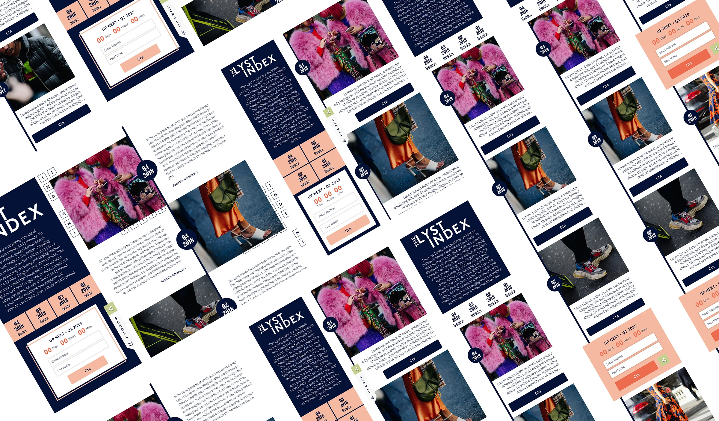
After an initial meeting in the Lyst offices, I was briefed to work in Sketch to create interactive mid and high fidelity wireframes to hand over to the in-house developers for a set of responsive pages within the Lyst site.
Deliverables
Mid-Fidelity Wireframes
High-Fidelity Wireframes
Sketch Files
Handover to Developers
💡 The largest global fashion search platform Lyst lets you search thousands of online fashion stores at once, bringing together 5 million products from 12,000 of the world’s leading brands and retailers in one place.
Mid-Fidelity WIREFRAMES
The Lyst Index is a quarterly ranking of fashion’s hottest brands and products. To compile the results, global fashion search platform Lyst analyses the online shopping behaviour of more than 5 million shoppers a month searching, browsing and buying fashion across 12,000 designers and stores online. The formula behind the Index takes into account global Lyst and Google search data, conversion rates and sales, as well as brand and product social media mentions and engagement statistics worldwide over a 3 month period.
↓
High-Fidelity WIREFRAMES
With the mid-fidelity wireframes and prototypes approved by the Lyst team and usability testing I carried out I then moved on to fidelity wireframes to ensure a clear translate to the developers and understanding how the colour palette, imagery and typography will compliment each other on the page.
↓
Developer Notes
I work across a number of programmes, suitable to each clients requirements. Generally, nowadays I work on Sketch for file creation as it’s the industry standard and create prototypes in Invision. In this case, the developers required a Sketch file and within this were notes for the developers to identify static components amongst various other usability functions to note.
Typography & Colour
Already established with Lyst were the brand guidelines. It was therefore my role to ensure these were followed when implementing the design.
DESIGN Heuristics
Having performed numerous heuristic evaluations, when designing UI interfaces I design with these heuristics boldly in mind throughout the process to ensure the best user and usability experience. Below you will see examples of how the heuristics work their way in to every piece of my work.
↓
Visibility of System Status
Ensuring the status is clearly visible and the user is informed of where they are within the application flow.
Match Between System & the Real World
As always, I avoid overly technical explanations and use real-world concepts already familiar to the user. Such as the share icon.
User Control & Freedom
Ensuring that exits are clearly marked with the logo always existing on the page and the lefthand menu implemented to be static for all key information/navigation to be available at all times.
Consistency & Standards
Across all devices that I was briefed to design on, it is vital that in this increasingly device-agnostic world we live in, a consistent user interface throughout all devices is designed and implemented.
Recognition Over Recall
To ensure my designs do not waste users valuable mental real estate my designs clearly display all instructions when relevant to help guide the user. For example using the word scroll along with the icon.
Aesthetic & Minimalist Design
Known for my minimalistic design, the wireframes are informative to the user and use visual cues rather than lengthy instructions.
CONCLUSION
I was tasked with this project to assist the Lyst design, marketing and developer teams at a crucial stage of business development. They found that the quarterly reports of which I was briefed to design a responsive user focused template for was a key business tool for their rapidly growing business - attracting industry, press and customers looking for an interactive educational tool.
The team now have a user focused, on brand responsive template for all quarterly reports moving forward, allowing them to focus on purely producing the quality content.
↓
OTHER DESIGN Services
↓
PEOPLE SAY Nice Things
↓
“Lauren is an exceptionally talented, hard-work and diligent professional. She works swiftly and is totally reliable. She understands our business goals and has become an integral part of the team, leading all our UI and UX work. She is currently instrumental to a complex multi-territory re-platforming and site build.”
“Lauren is a rare designer who is able to take any brief (no matter the detail) and quickly and stylishly incorporate what is needed into a fantastic creative. Working with Lauren across multiple digital & offline channels was always enjoyable - and looking forward to receiving her designs was a real pleasure!”
“Lauren is a huge asset to our team; she came into the business at a busy and stressful time and has been an absolute delight to work with. She has easily adopted and enhanced our brand handwriting. Lauren is efficient, focussed and gets the job done to a very high standard and has become an integral part of our team and is high respected in the business. She is also flexible to our needs, adding extra time during our busy periods, which is much appreciated. In a busy and often stressful fashion environment she is calm, collected and fun to work with.”
“Just spot on - thank you!”


