

My role:
Freelance Senior Lead UX
Reporting to:
Creative Director & Clarks Leadership
Leading:
x2 Junior & x1 Mid-weight Designers
Clarks Shoes
Clarks Shoes, renowned footwear brand with a rich heritage dating back to 1825. A robust e-commerce presence, that has continued to evolve, boasting a substantial turnover that reflects their global appeal and commitment to quality.
I had the privilege of spearheading the comprehensive UX analysis and redesign of Clarks' shoes global responsive websites on behalf of Like Digital. Below I dive into the details of our project, exploring the challenges, insights, and innovative solutions that have shaped the future of Clarks Shoes' digital ecosystem.
My contributions:
-
Clarks global leaders joined us both in person (Somerset UK Head Quarters) and via video conferencing. We came together to discuss and align on project goals, requirements, and user needs. These workshops foster a shared understanding of objectives and facilitate input from diverse perspectives, ultimately leading to more user-centered and effective design decisions.
-
I conducted a heuristic analysis to begin evaluation of Clarks’ interface usability. I applied a set of established usability principles or "heuristics” which helped both familiarise myself with the interface and start to identify high level potential usability issues and areas for improvement early in the design process.
-
Item description
-
Item description
-
Item description
-
Description text goes here
-
Description text goes here
-
Description text goes here
-
Item description
-
User Testing
With a deep commitment to:
Enhancing user satisfaction
Streamlining navigation
Enhancing user satisfaction Streamlining navigation
Driving conversions
Increasing basket value
Meet business goals
Driving conversions Increasing basket value Meet business goals
Myself and my team embarked on a journey with Clarks Shoes’ global leadership to transform their online presence to be:
A user-centric, visually appealing and seamlessly functional platform.

Discovery UX
Stakeholder workshops & interviews
Clarks global leaders joined us both in person (Somerset UK Head Quarters) and via video conferencing. We came together through a set of three workshops to discuss and align on project goals, requirements and user needs.
Why: Workshops foster a shared understanding of business objectives and facilitate input from diverse perspectives, ultimately leading to more user-centered and effective design decisions.
Outcome: The workshops findings gave a holistic overview of where Clarks were are at, where they were heading, what roadblocks needed to be considered and where to should focus.

Workshop key output: The key UX journeys were defined through careful consideration and elimination.

Problem: It was established that we were unable to implement new features, components or content for this project. The task now to improve rather than re-invent.
Solution: I created an ever-evolving document throughout the process keeping note of future scope requirements, this was categorised by priority and the scope of work defined with the development agency to give a traffic light system of deliverability.
Discovery UX
Heuristic Evaluation
I conducted a heuristic analysis to begin evaluation of Clarks’ interface usability. I applied a set of established usability principles or "heuristics” which helped both familiarise myself with the interface and start to identify high level potential usability issues and areas for improvement early in the design process.
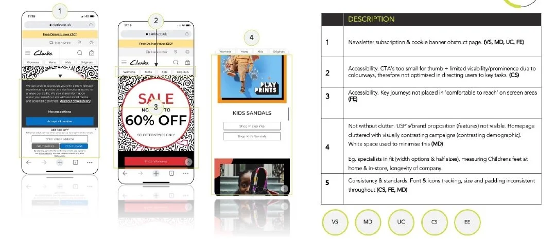
Mainly, I found repeated issues with the following two Heuristics “Aesthetic & Minimalist Design” and “Consistency & Standards” whereby the hierarchy of pages/information was not clear/refined/correct and therefore contributed to cognitiveoverload and confusion for users. Example. Homepage banner CTA’s using lower case font, other areas capitalised, on top of busy graphic and colours used not accessible with contrast ratio.

Discovery
Data Analysis
Using Google Analytics and Content Square, myself and the team dove deep in to identifying potential problems for users in reaching goals, potential causes of issues and adding data to supplement qualitative persona research.
Finding: We identified, the drop off rates during the checkout process realising the guest checkouts first step requirement (enter email) was leading to an increased drop off rate. This said, the leading percentage of orders were from guests checkouts. We therefore started to question the value hierarchy of requiring users to log in which in turn creates the need for a ‘guest’.
Finding: The conversion rate of users who used search increased dramatically, by up to 130% on mobile indicating a requirement for focus in this functionality and journey.
Thoughts.
🔍 Search
How to we utilise this to best serve the needs of all demographics?
🛍️ Checkout
Do users have all of the information they need to make a decision?
🤝 Guest checkout
Do we need this - how can we better this process?
🎨 Colour
How can we best educate and navigate users to alternative colorways?

This Project Vision documentation is referred to by the whole design team moving forward as a priority and goal reference point when designing.
Define
Project Vision
With this vast amount of insight and learnings, we had progressed to a point in the UX process where we were able to form a project vision. A project vision is an aspirational statement that answers the question; what do we want to become and how do we action this?
1. Vision
2. Objectives
3. Tactics
1. Vision 2. Objectives 3. Tactics

💡 This task could have been delved into infinitely, therefore the output of these personas reflected the needs of the user, business and importantly timelines of the project.
Define
Personas
Personas are fictional characters which represent certain traits and qualities of real users, this forms a key tool for understanding and empathising with the target audiences.
Through data analysis, reviewing internal documentation and stakeholder feedback, we concluded to identify Clarks key personas by product category type and global territory. The product categories are tailored to specific customer needs, as, for example the needs of an adult male looking for a wedding shoe differs vastly to the needs of a customerlooking to purchase their babies first shoe.
This task could have been delved into infinitely, therefore the output of these personas reflected the needs of the user, business and importantly timelines of the project.
